

UX CASE STUDY | WEBSITE DESIGN | WINE INDUSTRY
Designing Trust
How a digital first platform replaced the role of offline relationships in a high risk, low frequency purchasing category.
Mobile First Experience
Premium Brand Storytelling
25K monthly visitors in a Premium Niche
View All Work

OVERVIEW
RESEARCH
SOLUTION
RESULTS
OVERVIEW
A new entrant in a relationship locked market
Pinnacle Oak operates as the exclusive Australian distributor of premium French oak barrels crafted by the Sylvain family.
The business sits within a specialised B2B supply chain, serving wineries that rely on high-quality oak barrels as a critical component of wine production
CLIENT
Pinnacle Oak | Cooperage Agent
ROLE
UX/UI Designer | Team of 9
DURATION
4 Weeks Design Sprint
YEAR
2024
DELIVERABLE
Research & Analysis, High-fidelity & Interaction
Mobile optimisation
RESEARCH
Understanding the Industry
To quickly immerse ourselves in this highly specialised industry, we conducted:
Desktop research on cooperages and the wine industry
Competitor analysis of existing cooperage agents
Heuristic evaluations
Stakeholder interviews
User interviews with winemakers and industry professionals
Problem Statement
Winemakers struggle to evaluate and trust a new cooperage agent in a relationship-driven market. Without established credibility, even premium products fail to convert, creating friction in the buying journey and constraining business growth.
In Depth Interview
Interviews with three winemakers across premium Australian wine regions surfaced a consistent pattern: decisions were driven by certainty of outcome, not volume of information. Four themes emerged.
What winemakers told us

If I don’t know exactly where the oak comes from, I won’t use it
Grain, toast, and seasoning all change the final win
We usually go with who we know. Switching suppliers isn’t something we take lightly
I’m not experimenting with barrels. One wrong choice affects the entire vintage.
Experience model
Rather than optimising for immediate conversion, the experience was structured to progressively reduce decision risk, mirroring the natural arc of a trusted offline supplier relationship.
A trust-first conversion architecture
Trust

Understanding
Validate
Enquiry
SOLUTION
Trust starts with transparency
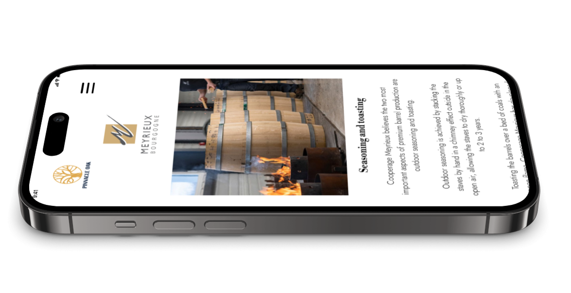
We designed the experience to answer the key questions winemakers ask before purchasing: the origin of the oak, the barrel-making process, the people behind the craftsmanship, and the experts who guide them along the way.
ORIGIN | PRODUCTION PROCESS | PRODUCT SPECS | THREE GENERATION OF SYVAIN COOPERAGE | EXPERT GUIDE BY PINNACLE OAK
Transparent provenance narrative
A structured Forest → Grain → Seasoning → Toast → Barrel journey made production quality traceable rather than assumed, transforming a marketing claim into a verifiable truth.
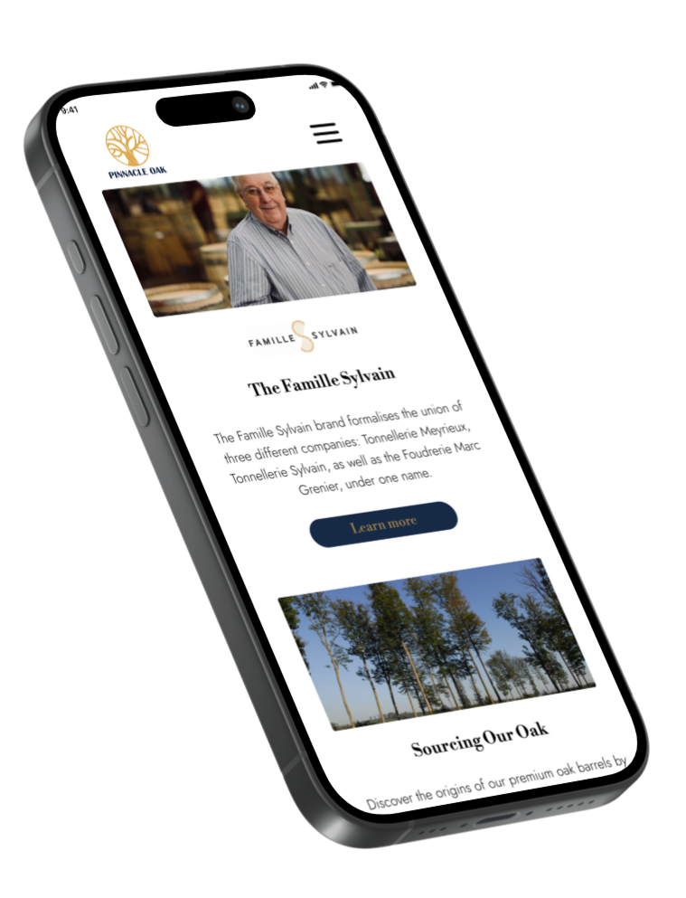
Establish immediate credibility
Positioned Pinnacle Oak as the exclusive Australian partner of the Sylvain family, anchoring the brand in French provenance and legitimate authority from the first moment of contact.
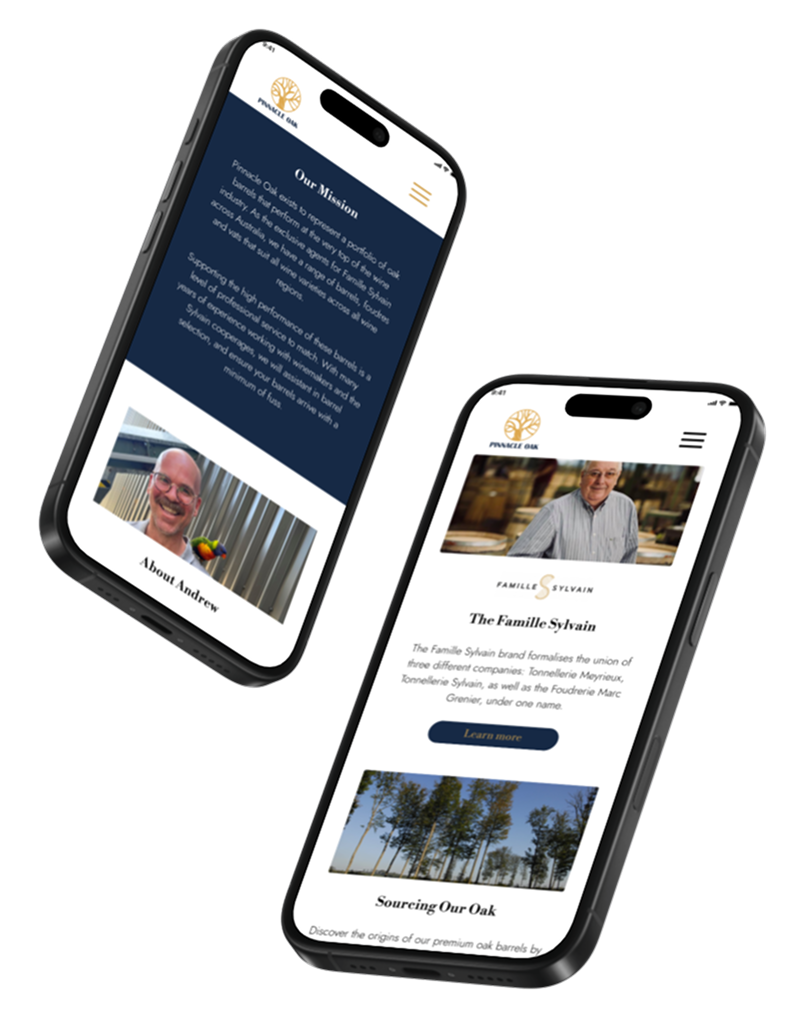
Education as trust infrastructure
A supporting content layer, covering barrel impact on wine flavour, selection guides by varietal, and oak characteristic breakdowns, replaced the missing word-of-mouth validation with structured expertise.
Based on user insights, we transformed complex barrel knowledge into easy-to-scan accordion content, allowing winemakers to quickly find the information they need and access expert guidance with minimal effort.
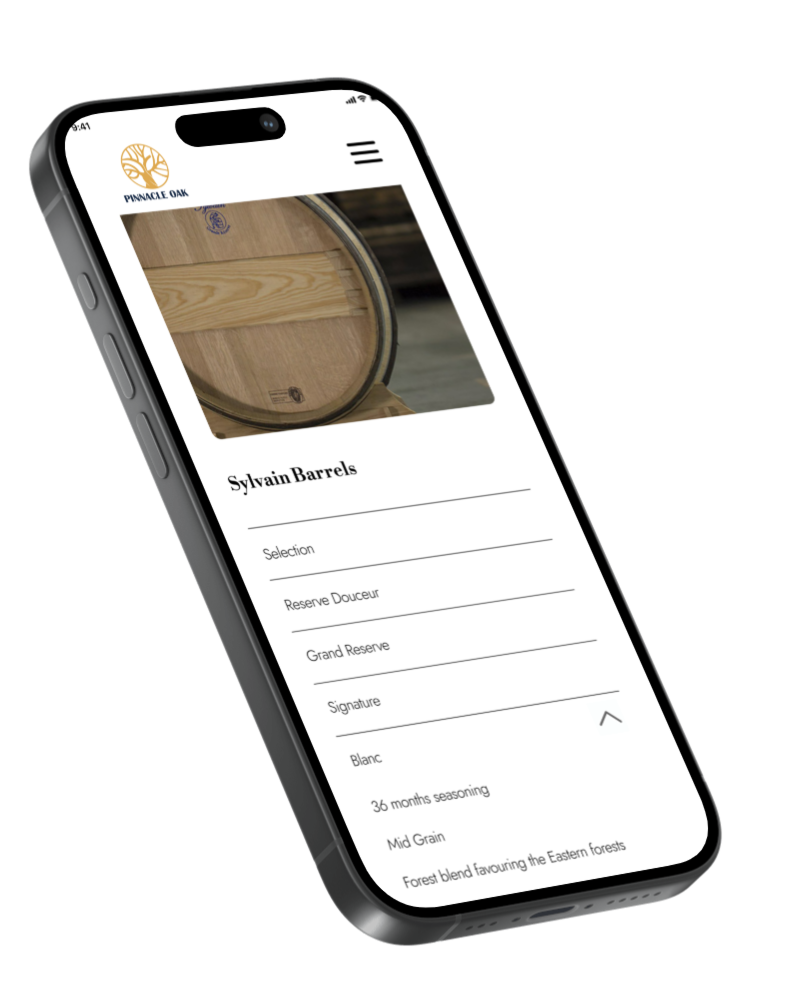
Technical complexity into decision clarity
Product attributes (barrel size, grain tightness, toast level, wood origin) were reframed as structured, comparable specifications.
Reducing cognitive load while preserving expert level rigour.
Typography & Colours
The visual identity was designed to balance heritage with modernity. Libre Bodoni was chosen for its elegant, premium feel, reflecting the craftsmanship and tradition of French cooperage, while Jost provides clarity and readability across digital experience.
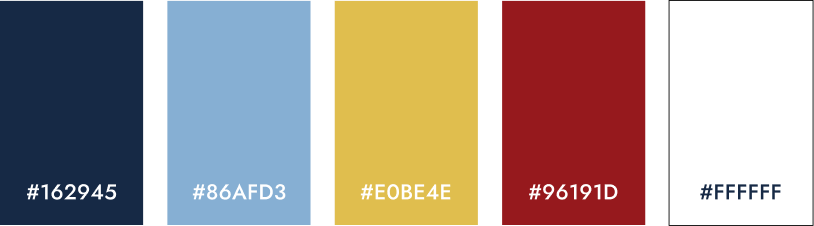
The colour palette draws inspiration from the wine industry itself. Deep navy conveys trust and expertise, gold represents craftsmanship and quality, and burgundy references the richness and heritage of fine wine. Together, the typography and colours create a refined, trustworthy brand that positions Pinnacle Oak as a premium and credible partner.
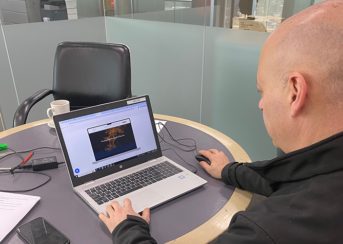
Usability Testing
User testing showed that the initial wireframe buried "Oak Sourcing" under the Resources page. Winemakers flagged it as essential, and increasing its visibility improved user engagement and the likelihood of enquiries.
“ It is really important to know what forest the oak originates from.”
– John
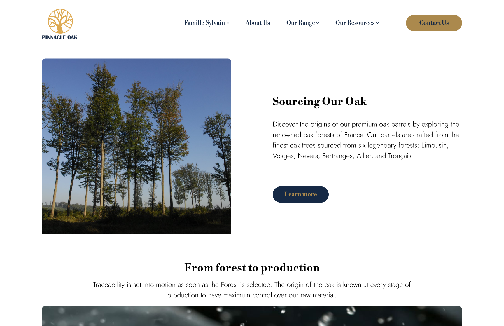
By relocating "Sourcing Our Oak" to the homepage and linking directly to a dedicated Oak Origin page with a geographic map, we clarified the wood origins for winemakers and strengthened the brand’s credibility.
Final IA
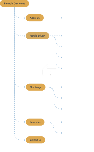
RESULTS
Measurable Impact
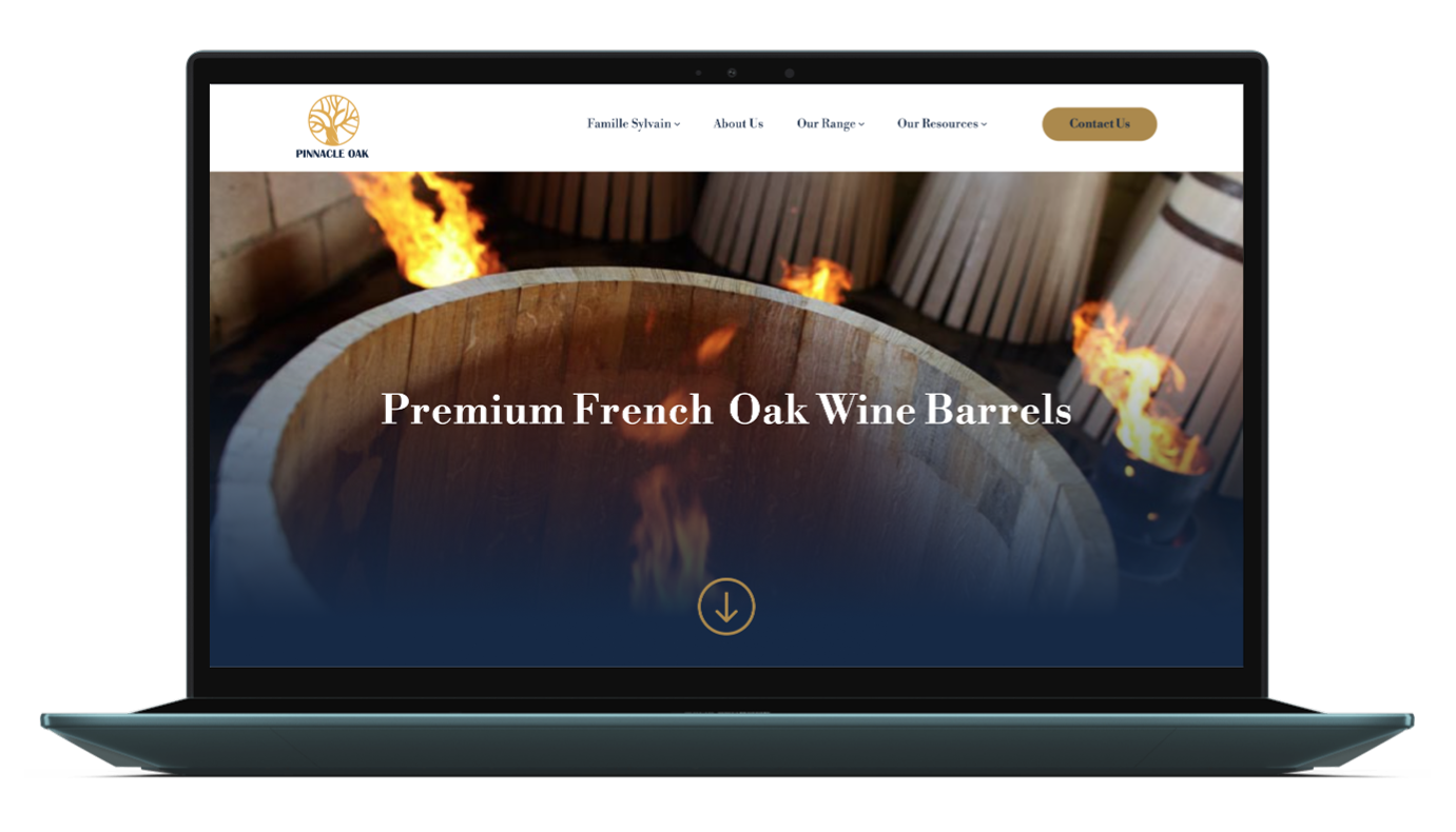
Within the first 12 months post launch, the new Pinnacle Oak website attracted over 25K monthly visitors, establishing a strong digital presence within a niche premium market.
Built from the ground up, the platform transformed complex product knowledge into an accessible educational experience for winemakers. Through strategic information architecture, storytelling, and a clear user journey, the website provides a scalable foundation that supports customer education, strengthens brand authority, and builds long term credibility.
What I learned
“This project reinforced the importance of building trust through digital experiences, especially within specialised industries where customers need confidence and clarity before making decisions.
I learned that thoughtful information architecture can reduce user uncertainty by organising complex information into a clear and accessible journey.
The project also highlighted the value of deeply understanding niche audiences and their needs, as meaningful UX solutions come from combining user insights, industry knowledge, and strategic content design.
Strong collaboration and clear communication were essential in keeping the team aligned and focused throughout a fast paced design process.”
Live website www.pinnacleoak.com.au