

UX CASE STUDY | REDESIGN WEBSITE | SERVICE INDUSTRY
Visibility to Enquiries
106.5%+
Organic Growth After Launch
5TH
Google Keyword Rankings
3.3%+
Conversion Rate
A full scale UX and brand redesign for Whistle Clean Australia, transforming a generic service website into a trust first, conversion optimised digital experience that reflects the business's quality and professionalism.
View All Work

OVERVIEW
RESEARCH
SOLUTION
RESULTS
OVERVIEW
Redesigning a Commercial Cleaning Brand
Whistle Clean Australia wanted to strengthen its online presence and improve visibility in a competitive commercial cleaning market. The existing website lacked a clear value proposition and failed to communicate the company's services, values, and environmental initiatives, creating confusion for potential customers and job seekers.
CLIENT
Whistle Clean Australia
ROLE
UX/UI Designer | Team of 9
DURATION
4 Weeks Design Sprint
YEAR
2024
DELIVERABLE
Branding, SEO, Web Design &Mobile Optimisation
RESEARCH
Every decision grounded in real user data
Before any wireframe was drawn, we ran a structured discovery phase, combining stakeholder interviews, competitor analysis, and user interview to map the full landscape. The numbers below represent the scope of our research foundation.

Spoke to 2 existing clients and 1 job seeker
Recurring themes:
Reliability anxiety, communication frustration, and the desire to see the people behind the service.
10 Melbourne commercial cleaning websites analysis
Opportunities:
While competitors effectively use SEO keywords to improve search rankings, many websites lack engaging visuals and a modern user experience.

“The last thing I want is staff complaining about dirty bathrooms. I need a cleaner I can trust without having to constantly check in.”
Facility Manager, -Existing Client
Sarah R
Reliable cleaners
No generic cleaner
“Parents are key stakeholders. Any chemical smell or allergen concern can instantly erode trust. Eco-friendly and child-safe cleaning products are not optional, they are essential.”
Childcare Director - Existing Client
Michelle T
Child-safe product
Eco-friendly
“I want to know what the company is really like before I apply, not just the job title.”
Experienced Cleaner-Job Seeker
Sarah Nguyen
Company culture
Value employee
The problems
Primary Users
Commercial property and facility managers were looking for a reliable cleaning provider but struggled to differentiate Whistle Clean from competitors. The website lacked clear service messaging, trust signals, and evidence of the company's value.
Secondary Users
Job seekers wanted to find employers whose values aligned with their own but found it difficult to understand Whistle Clean's culture, career opportunities, and commitment to sustainability through the existing website.
Stakeholder Interview & Business Goalss
Stakeholder sessions highlighted a disconnect between the company's growth goals and the experience the website provided. Although the business wanted to attract more clients and build trust, users struggled to understand the services and navigate the site. Aligning business objectives with user expectations helped prioritise the improvements that would have the greatest impact.
Branding
Re-build a visual identity and content strategy that communicates Whistle Clean's experience, accreditations, and real results, not just generic service descriptions.
SEO & Content
Restructured content and information architecture to improve search visibility and help users quickly find the right cleaning services.
Mobile First
Over 68% of their existing traffic was mobile. The redesign needed to prioritise thumb-friendly navigation and instant clarity on small screens.
UX Strategy Funnel
Our strategy was structured in five layers, each addressing a different dimension of the user's journey, from the first impression through to post-conversion trust.
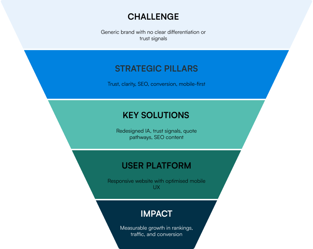
Why it matters : Low visibility, weak trust signals, and unclear messaging impacted enquiries and recruitment.
Our Focus : Five strategic pillars shaped the redesign, structured content, keyword relevance, helpful information, clear navigation, and mobile-first optimisation.
How We Did It : The business's real story and culture needed to do the convincing, not stock photography. Founding story,Tree nation storytelling, named team, values-in-action, expertise with eco-friendly cleaning services and social proof.
User Centred : A better experience for both potential clients and future employees.
What It Delivers : A website that supports the company's mission while driving long-term business growth.
SOLUTIONS
User Friendly Platform
A user centred redesign that turns the business's real personality, its founding story, its values, its people, into the thing that does the convincing, before a single sales conversation happens.
A homepage that proves itself in one scroll
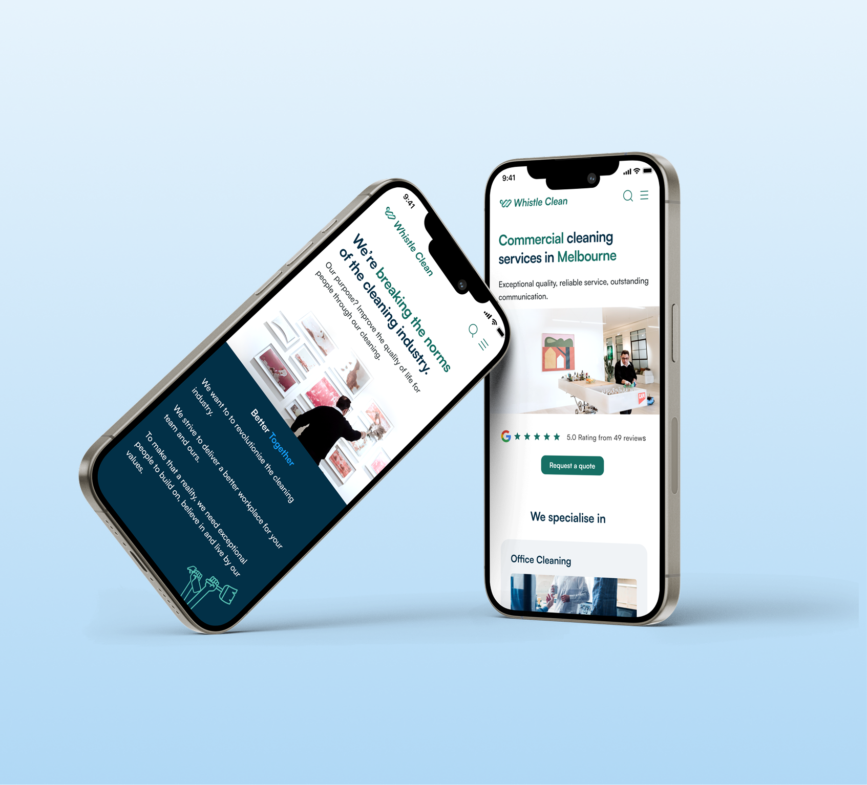
The new homepage opens with a star rating and review count directly under the headline, followed immediately by the three core services, then client logos, then named trust pillars. A visitor never has to wonder whether this is a credible business, the proof arrives before the pitch is even finished.
Information Architecture
SEO
Mobile Friendly
A brand voice no competitor could copy
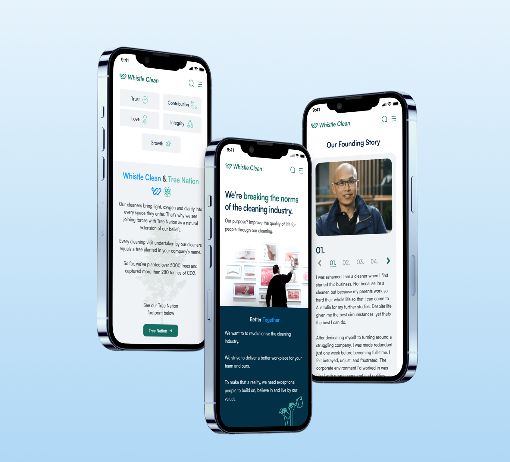
"We're breaking the norms of the cleaning industry" became the spine of the About section, backed up, not just claimed. Five named values (Trust, Contribution, Love, Integrity, Growth) are paired with a genuine differentiator, a partnership with Tree Nation, where every cleaning visit equals a tree planted in the client's name.
By the time a visitor reaches the founding story, the founder telling his own story on camera, from 2014 to today. Whistle Clean has stopped looking like every other cleaning company on the page.
Brand identity
Emotional trust
User Journey
People, not placeholders
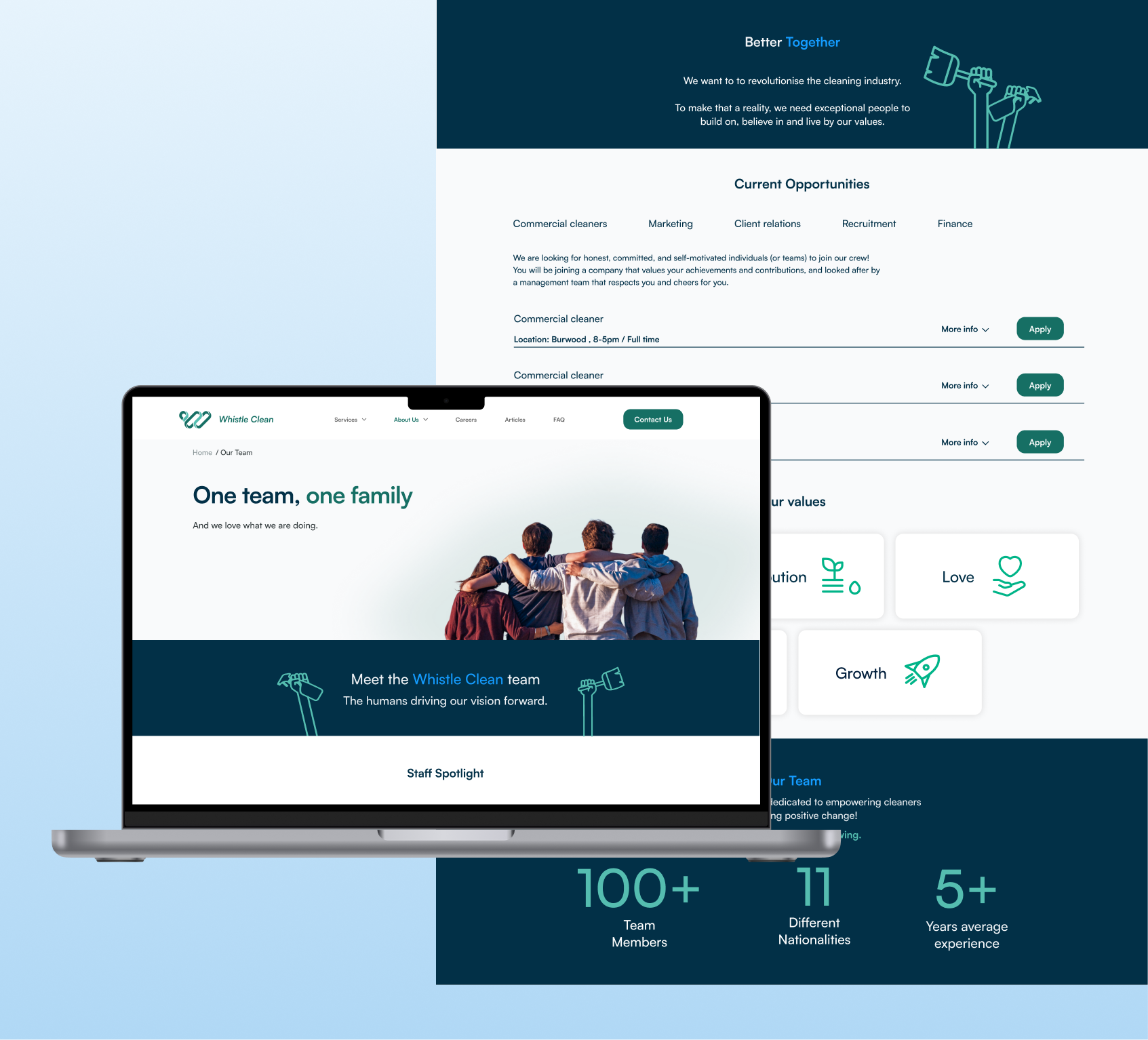
Every cleaner on the team page is named, photographed, and shown with their tenure "8 Years with Whistle Clean," "6 Years with Whistle Clean" turning staff retention into a visible trust signal most competitors can't match. A rotating staff spotlight gives individual cleaners a voice, building client trust while showing prospective hires what the culture actually feels like.
Company Value & Culture
Social proof
Trust signal
Improved Service Communication & Sustainability Storytelling
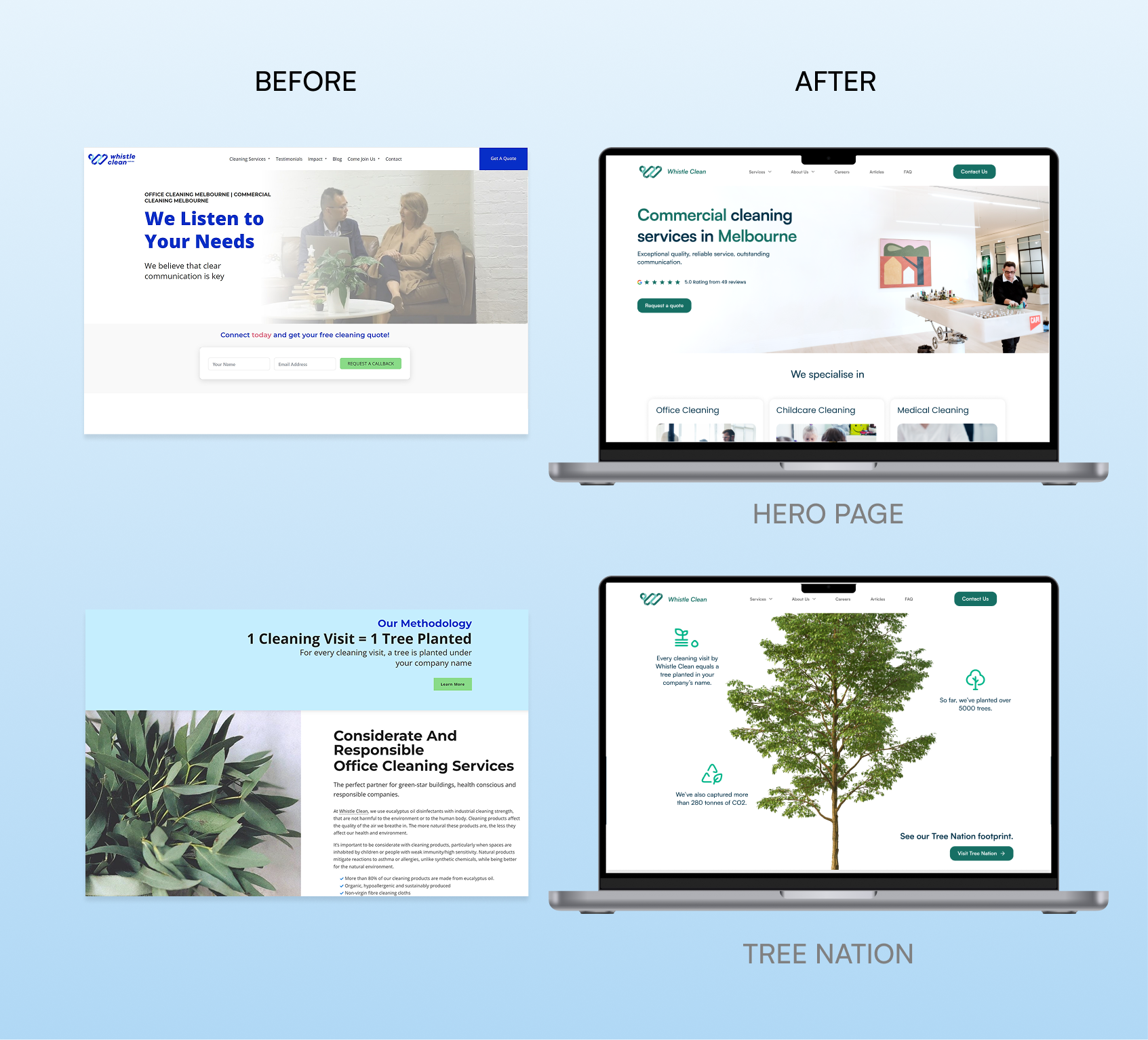
The previous website lacked a clear value proposition and did little to differentiate the brand. The redesign introduced service-focused messaging, stronger visual hierarchy, and prominent trust signals to improve immediate understanding. The sustainability initiative was also elevated into a dedicated Tree Nation experience, reinforcing Whistle Clean's environmental commitment and strengthening overall brand credibility.
Visual Language
Content Clarity
Storytelling
Branding
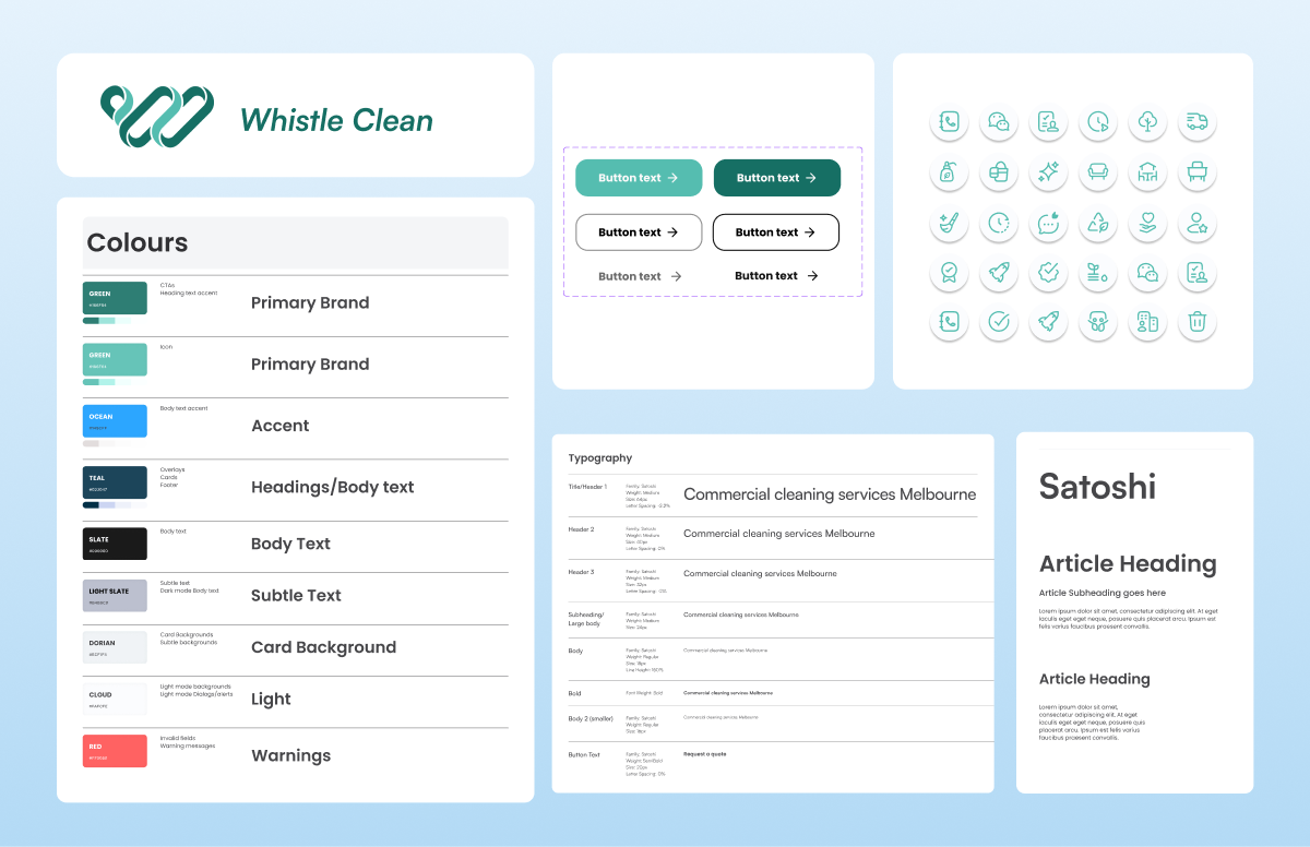
To better reflect Whistle Clean Australia's commercial cleaning expertise, the brand identity was refreshed with a redesigned logo, updated colour palette, and industry relevant imagery. The new visual direction improved brand recognition, strengthened credibility, and created a more professional digital presence.
RESULTS
12 Months After Launch
Before the redesign in June 2024, the website received 2,173 monthly visitors. Following the website launch in 2025, monthly visitors increased to 4,488, a 106.5% increase.
As part of the UX design process, we delivered high fidelity wireframes, information architecture recommendations, and SEO guidance for the development handover. This included keyword mapping, metadata recommendations, image alt text guidance, schema markup recommendations, and content structure principles to support search visibility while maintaining a clear user experience.
The project demonstrates how UX strategy, structured content, and SEO informed design decisions can help create a more discoverable and user friendly digital experience.
Reflection
What stayed with me after this project wasn't a new design framework or UX technique. It was seeing how quickly people decide whether they can trust a business.
The client had spent years building a strong reputation, but the website wasn't showing that story. A first-time visitor had no way to understand what made the business different from any other cleaning company.
Every design decision came back to one question:
"What would make me trust this business if I'd never heard of them before?"
That question shaped everything from bringing reviews above the fold, introducing the cleaners as real people with years of experience, to giving the founder a voice through video. None of these changes were complex, but together they helped the business feel more human and trustworthy before a customer ever made contact.
Live website www.whistlecleanaustralia.com.au