


Independent UX/UI Exploration | Travel E-Commerce | Micro Case Study
Clarity Without Compromise
Keeping useful information intact while creating a cleaner, more scannable interface that helps users navigate with greater ease.
The Opportunity
“A quick UX/UI audit of a content rich travel experience.”
Luxury travel interfaces need to balance inspiration with information. I explored the public Luxury Escapes experience to identify small opportunities to improve visual hierarchy, discoverability and ease of scanning without removing useful content.
The focus was not to redesign the experience, but to explore how thoughtful UI refinements could enhance the overall journey.
UI Audit
“What I observed.”
Information hierarchy
Rich offer content creates an opportunity to establish a clearer reading sequence.
Content density
Multiple details need to work together without overwhelming the user.
Feature discoverability
Useful tools such as the AI Trip Planner could benefit from stronger visual affordance.
Visual rhythm
Intentional spacing and grouping can help create a calmer, more premium experience.
Responsive behaviour
Complex content needs to remain easy to scan across different screen sizes.
Before → After
“Exploring small, thoughtful refinements.”
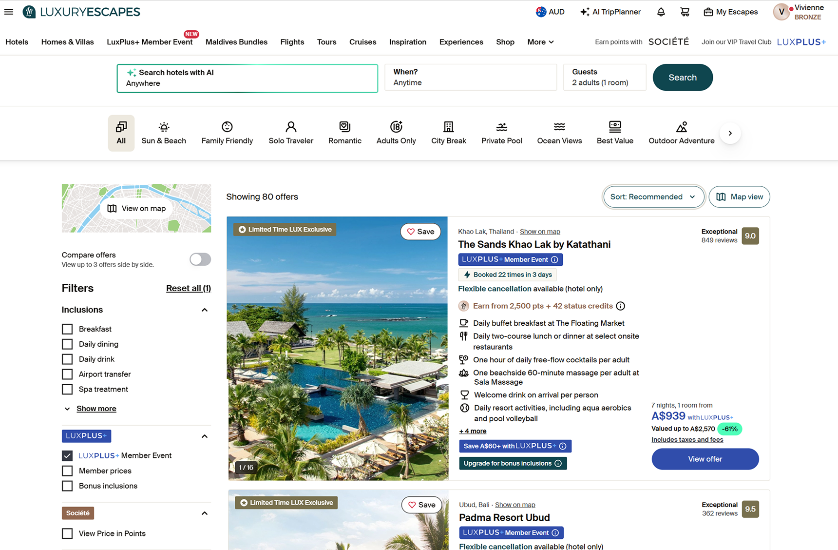
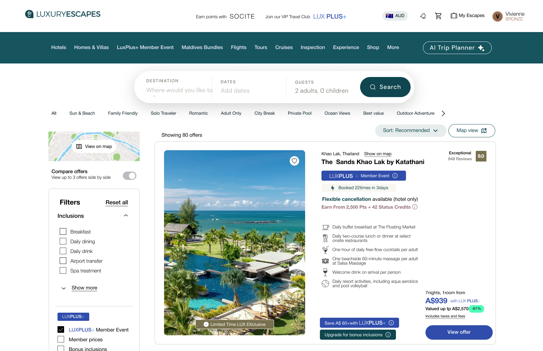
01 — Clearer Offer Hierarchy : Make the offer easier to understand at a glance
02 — More Discoverable AI Trip Planner : Strengthen affordance and help users discover a useful planning tool.
03 — More Breathing Room : Improve readability while retaining the information users need.
BEFORE
AFTER
Principles Shaping the Exploration
“Small refinements, considered as a system.”
My approach was to refine rather than remove — preserving useful information while creating greater clarity, hierarchy and discoverability.
01 — Prioritise the experience
Let imagery inspire while supporting key information.
02 — Design for scanning
Establish a clear hierarchy so key details can be understood quickly.
03 — Make value legible
Connect price, savings and inclusions into a clear value story.
04 — Create breathing room
Use intentional whitespace to reduce visual competition and improve readability.
05 — Make useful features discoverable
Give high value tools clear affordance so users can recognise and access them with confidence.
06 — Systemise, don’t one off
Turn repeated patterns into flexible, reusable components.
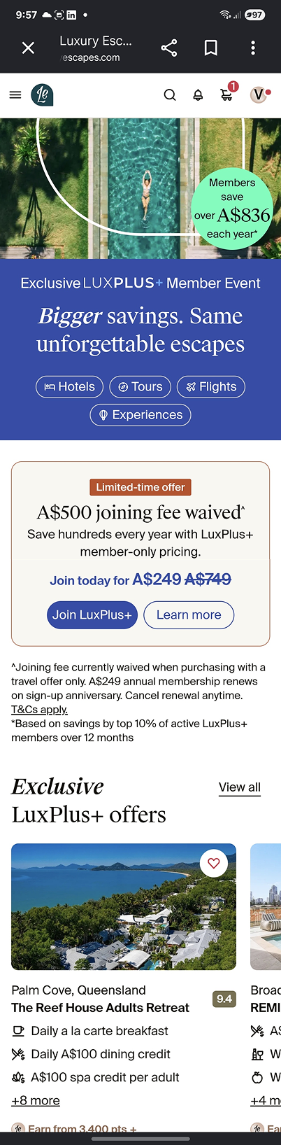
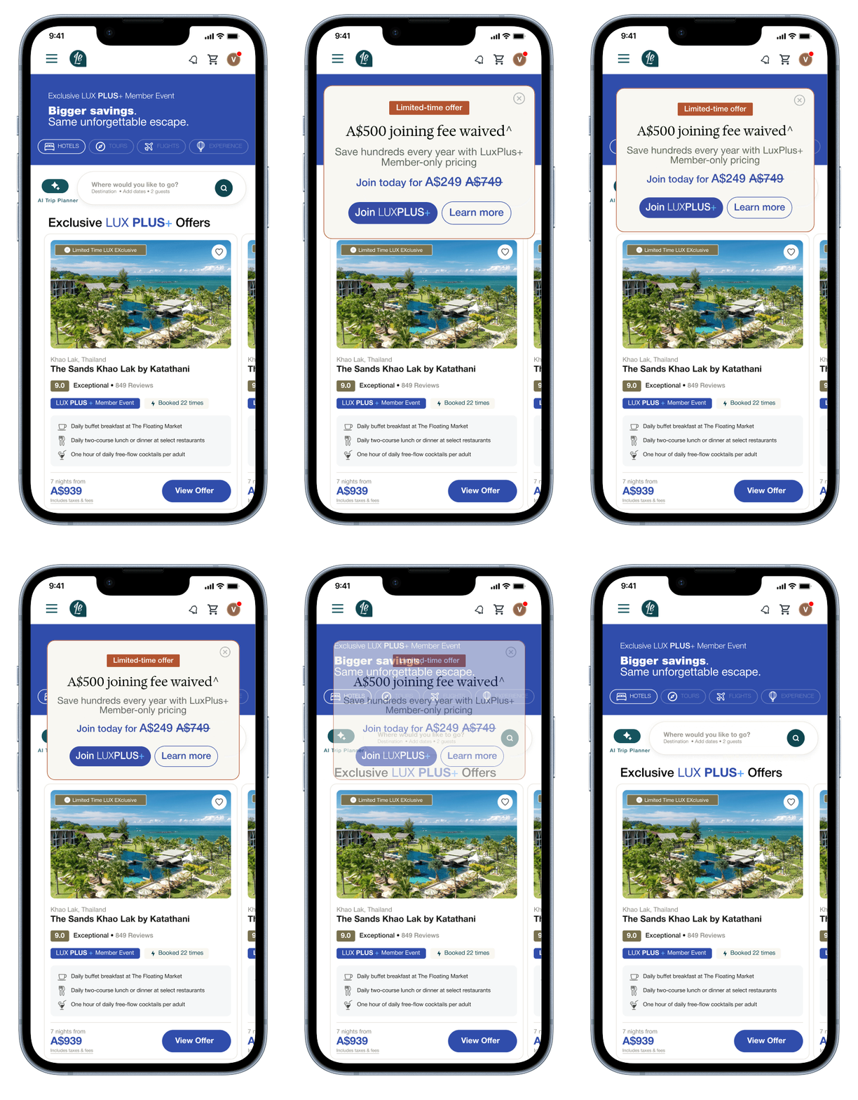
07 — Design for mobile
Simplify the scroll experience while keeping all essential content.
BEFORE
AFTER
From interface observation to design direction
Rather than making large scale changes, I focused on small interface decisions that can make a complex travel experience feel clearer, calmer and easier to navigate.
Independent Exploration
A self initiated, bite sized UX/UI exploration based on the publicly available Luxury Escapes website.
The concepts are exploratory and created to demonstrate my approach to UX thinking, visual design, interface auditing and design system thinking. They do not represent the internal design system or product direction of Luxury Escapes and are not affiliated with or commissioned by Luxury Escapes.